Grayscale Screen Printing Separation — Grayscale 1 and Grayscale 2 in OmniSeps
Learn how OmniSeps Grayscale 1 and Grayscale 2 separate artwork by luminance into standardized gray ink channels — and when to choose 6 channels vs 8 for smoother tonal reproduction.
9 Mei 2026
Screen printing a grayscale design — a black and white photo, a monochrome illustration, or any artwork that relies on tonal values rather than distinct colors — requires a different approach than spot color or CMYK separation. Instead of separating by hue, you are separating by brightness: how light or dark each area of the artwork is, and which gray ink density should carry it.
OmniSeps includes two dedicated grayscale separation modes: Grayscale 1 and Grayscale 2. Both analyze the luminance of your artwork and automatically assign each area to the correct gray ink channel. The difference is how many tonal steps each mode produces — and that choice directly affects the smoothness of your final print.
How Grayscale Separation Works
Standard spot color separation asks: “what color is this area?” Grayscale separation asks: “how bright or dark is this area, and which gray ink should print here?”
OmniSeps analyzes the luminance values across your artwork and maps each region to a specific gray channel. Darker areas go to denser gray channels; lighter areas go to lighter channels. The channels are then stacked in print order on the garment to reproduce the tonal range of the original artwork.
Both Grayscale 1 and Grayscale 2 also generate a BASE WHITE underbase channel and a WHITE highlight channel, making the output complete for printing on dark garments out of the box.
Why the Channels Are Named by Percentage
You will notice that the gray channels in both modes are named with percentages — GRAY 80%, GRAY 50%, GRAY 75%, GRAY 25%. This is intentional.
The percentage names exist so that your ink stock is always clearly defined. Every time you run a grayscale separation in OmniSeps, the channel names are consistent and standardized. That means you always know exactly which gray inks to prepare before going to press — no guesswork, no mixing on the fly. GRAY 80% always refers to the same ink density, every job, every time.
This is one of the more practical advantages of a structured separation workflow: the separation output itself becomes your ink preparation checklist.
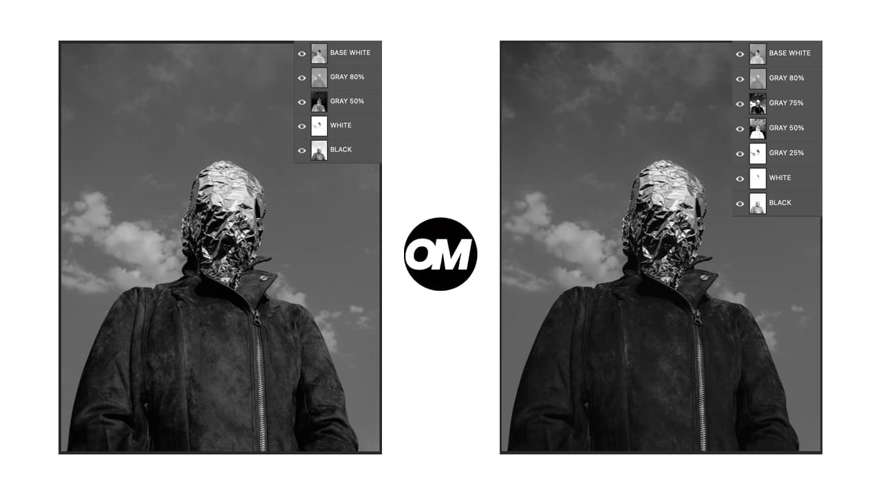
Grayscale 1 — 6 Channels
Grayscale 1 produces a clean, efficient output with six channels:
- T-Shirt Color — garment base color reference
- BASE WHITE — underbase white, derived from the darkest (most opaque) areas of the artwork
- GRAY 80% — dark gray ink plate
- GRAY 50% — mid gray ink plate
- WHITE — pure white highlight layer for the brightest areas
- BLACK — deepest shadow plate
With two gray steps between underbase and white, Grayscale 1 is well suited for:
- Artwork with clear, distinct tonal regions
- Designs that don’t require ultra-smooth gradient transitions
- Jobs where fewer screens mean lower cost and faster setup
Grayscale 2 — 8 Channels
Grayscale 2 extends the tonal range with four gray steps instead of two:
- T-Shirt Color — garment base color reference
- BASE WHITE — underbase white
- GRAY 80% — dark gray
- GRAY 75% — dark-to-mid gray
- GRAY 50% — mid gray
- GRAY 25% — light gray
- WHITE — highlight
- BLACK — deep shadow
The additional steps — GRAY 75% and GRAY 25% — fill in the gaps between the major tonal bands. The result is a smoother reproduction of gradients and photographic tones. Grayscale 2 is the better choice for:
- Photographs with complex tonal ranges
- Artwork with smooth gradients and subtle shadow-to-highlight transitions
- Jobs where print quality is the priority over screen count
Grayscale 1 vs Grayscale 2 — Which Should You Use?
If your artwork has clearly separated tonal regions — a high-contrast monochrome graphic, a simple portrait with strong shadows — Grayscale 1 is the practical choice. If you are working with a photograph or an illustration with continuous tonal variation, Grayscale 2 gives you more steps to reproduce that variation faithfully.
Layer Requirements
Both modes share the same strict validation before running:
- Document must be in RGB mode — convert via Image > Mode > RGB Color if needed
- Exactly one layer must be selected
- The layer must be a raster layer — no Groups, Smart Objects, Text, Shape, or Fill layers; rasterize first if needed
- Not locked, not hidden
- No Layer Mask or Clipping Mask
- Layer must not be empty
- Layer name must not be “Layer 1” or “Layer 2” — rename before running
- No leftover “OMNI GRAY” or “PREVIEW” layers — delete them from a previous run before running again
Non-Destructive Output
Like all OmniSeps separations, both Grayscale modes are non-destructive. Your original layer is duplicated for processing and preserved as a PREVIEW layer. No changes are made to your source artwork.
Fine-Tuning After Separation
After the separation completes, the full set of OmniSeps adjustment tools is available for per-channel refinement:
- Ink+ / Ink- — increase or reduce ink density on a channel
- Tone+ / Tone- — cut shadows or pull highlights
- Choke / Spread — adjust channel edge
- Levels / Brightness & Contrast — open Photoshop dialogs for that channel
Select any channel in the Channels panel first, then apply the tool.
Frequently Asked Questions
Do I need to convert my artwork to grayscale first?
No. Run the separation directly on your artwork in RGB mode. OmniSeps analyzes the luminance of the file automatically — you do not need to desaturate or convert beforehand.
Why are the channels named with percentages like GRAY 80%?
The percentage names are standardized intentionally. Every grayscale job produces the same channel names, so your ink preparation is always consistent — GRAY 80% always means the same gray ink density, every time you print.
Can I use Grayscale 1 or 2 on a color artwork?
Yes. The separation reads luminance, not hue. A colorful image will be separated as if viewed in grayscale — each color’s brightness value determines which gray channel it maps to.
When should I use Grayscale 2 instead of Grayscale 1?
Use Grayscale 2 when your artwork has smooth gradients or photographic detail that needs more tonal steps to reproduce cleanly. For simpler, high-contrast artwork, Grayscale 1 is sufficient.
What is BASE WHITE for?
BASE WHITE is an underbase layer derived from the opaque areas of the artwork. It prints first on dark garments to give the gray inks an opaque surface to sit on. Without it, gray inks on a dark shirt would appear muddy.
Conclusion
Grayscale 1 and Grayscale 2 give screen printers two levels of tonal depth for monochrome and luminance-based separations. The standardized percentage naming keeps your ink stock consistent job after job, while the automatic channel extraction handles all the tonal analysis automatically. Choose the number of steps based on the complexity of your artwork — and use the adjustment tools to dial in the final output.
Try OmniSeps free for 15 days
Automatic color separation for Photoshop & Illustrator. No credit card required.
Claim Free TrialMore articles
Ubah Desain Jadi Halftone untuk DTF dan DTG — Otomatis di Photoshop
Mau hasil DTF dan DTG terlihat seperti sablon manual? OmniSeps konversi artwork PNG jadi halftone yang bisa dikustomisasi — frekuensi, sudut, dan bentuk titik sesuai selera.
Tanda Registrasi untuk Sablon — Otomatis, Bernomor, dan Sadar Arah
Tanda registrasi otomatis untuk film sablon — dihitung dari desainmu, diberi nomor otomatis, dan sadar arah untuk orientasi film apa saja.